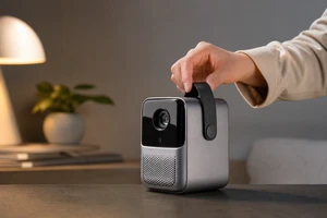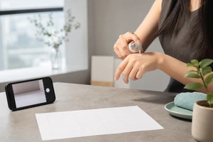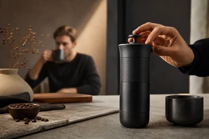
A product-video media review should not focus only on click-through and completion rates. A more effective approach maps metrics back to three visual categories: the opening screen, functional proof, and usage context. What did users see, what did they understand, and what can still be cut for the next round? Using three key frames from the real CHiQ built-in refrigerator case, brand content and media teams can verify visual tasks directly in the review meeting instead of asking by intuition to “cut a few more versions.”
First, Turn the Media Review from a Metrics Table Back into Shot Tasks
Shots in the same product video are not automatically suitable for every placement. The opening screen identifies the product and setting, functional shots remove specific concerns, and lifestyle shots create identification. In a review, first mark which visual category each version uses, then examine viewing, engagement, and landing-page actions. This prevents a generic “performance declined” diagnosis from being blamed on editing pace. TikTok’s official creative advice emphasizes stating the content proposition in the first 3 seconds and continuously testing clearly differentiated assets. This requires preserving independently usable visual units rather than only one finished film.
First Frame: Make Delivery and Installation Prerequisites a Recognizable Input
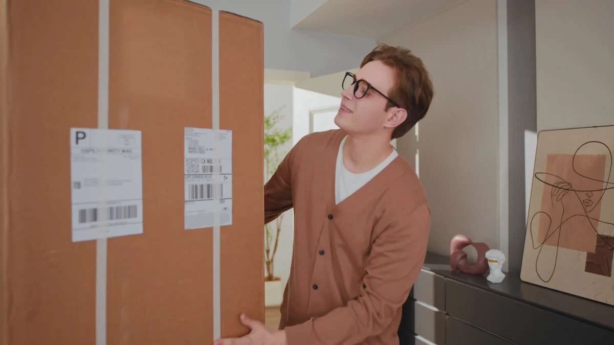
The shot at 22 seconds is not a product close-up, yet it answers an often-missed question: does the user understand how the product enters their life? Packaging, a person, and the home environment form an extractable setup scene. If this shot is absent from the media version, adding selling-point copy later will still struggle to establish the basic understanding “I can put this in my home.” In a review, classify it as a context-input shot and separately test its role at the start of the landscape main film, as the second shot of a vertical cut, or in a product-page explanation segment, rather than making it compete with a control-panel shot for the same task.
Second Frame: Give Functional Proof to an Action Understood at a Glance
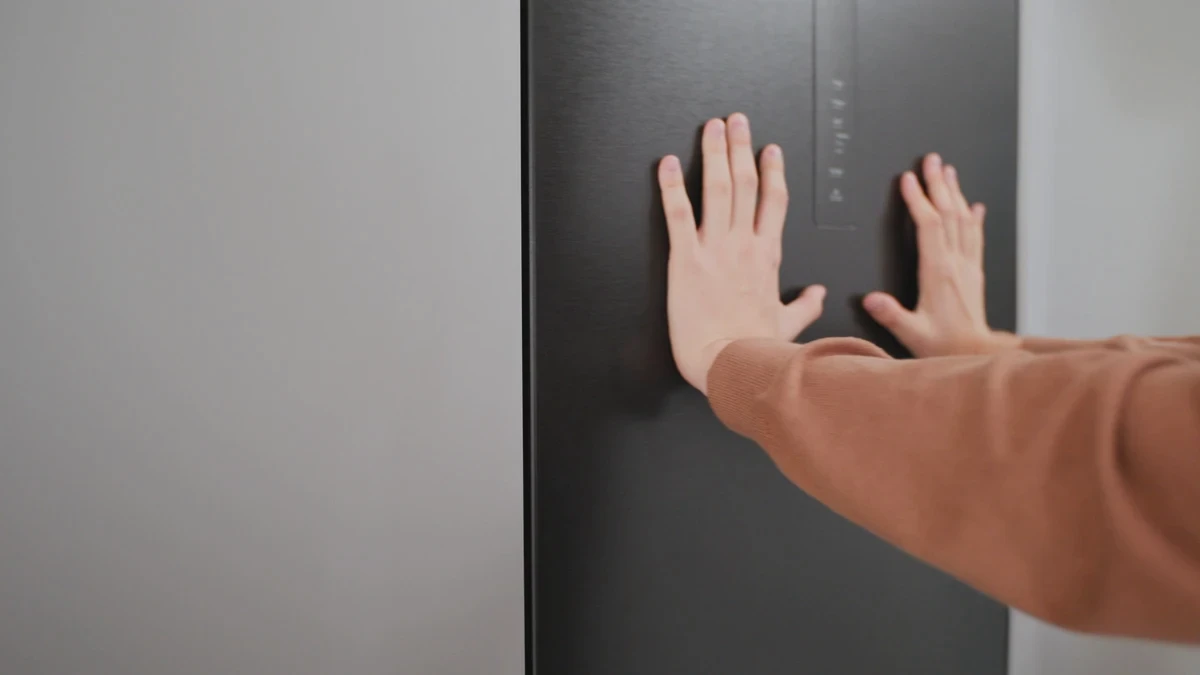
The close-up at 25 seconds places the hand, door panel, and control area on the same visual path. It needs no extra explanation that “this is a refrigerator”; it lets users judge touch, material, and operation. In a media review, mark this type of shot as functional proof rather than mere atmospheric B-roll. Google Ads video specifications prioritize 16:9 and 1080p for landscape versions and advise keeping important products and text in safe areas. This close-up can therefore serve as a 16:9 product-page segment and, after recomposition, a vertical cut, but text and buttons should not cover the hand action.
Third Frame: The Opening Screen Should Position the Product Memorably, Not Pile Up Information
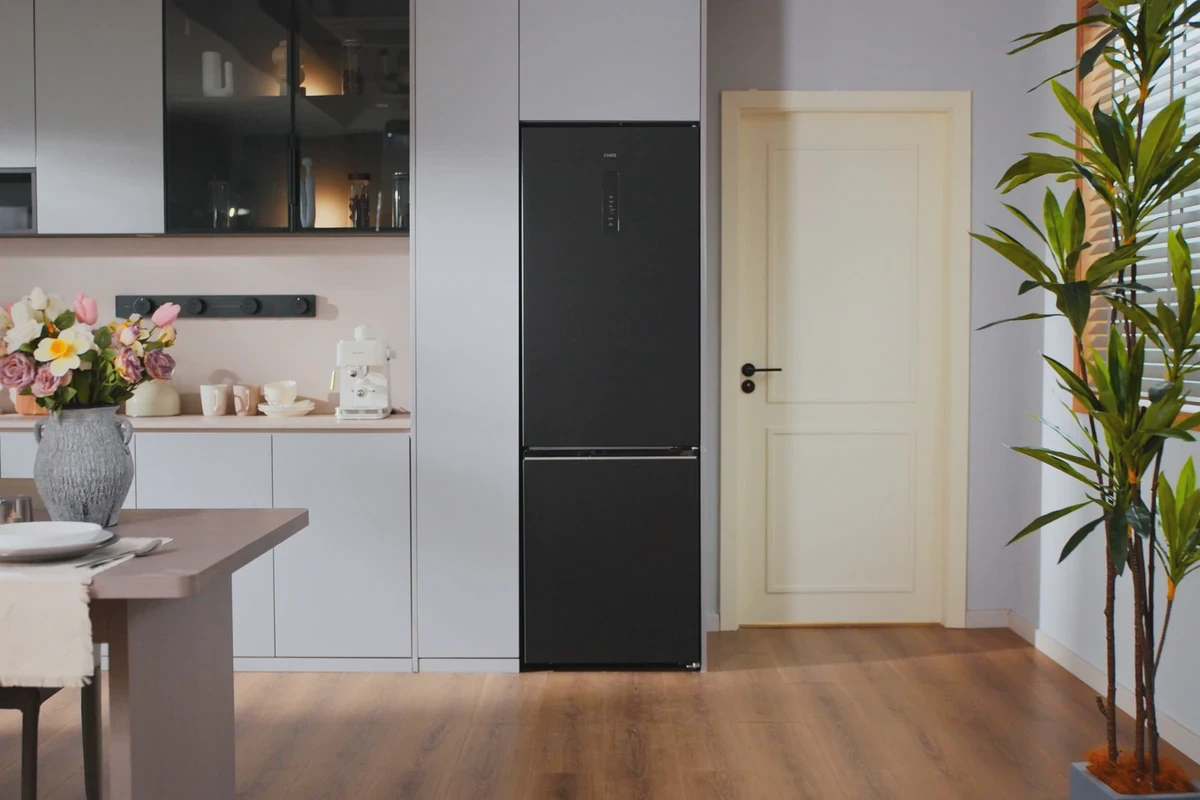
The wide shot at 38 seconds places the black built-in refrigerator on the kitchen’s center axis, with the dining table, counter, and plants establishing spatial scale. It suits the landscape main film’s recognition image and can also provide a still for a catalog page, YouTube cover, or sales demonstration. The key is not to put all copy in the frame, but first to confirm the product silhouette, usage environment, and negative space available for a title. Meta’s advertising guide provides dimensions, file sizes, and technical requirements by format and placement. Production teams should therefore write safe areas for landscape, vertical, and square formats into shot tasks during filming and editing rather than forcing crops at final delivery.
Organize the Three Frames into a Reusable Version Matrix
These three frames can be divided into different media tasks: the wide shot handles opening-screen recognition, the packaging scene introduces the question of “delivery and entry into daily life,” and the close-up provides functional proof. Preserve a clean master, captioned version, and platform crop for each category so the review has traceable asset granularity. For TikTok, place people or usage actions in the faster opening seconds while maintaining 9:16 and interface safe areas. For YouTube and the brand website, preserve the 16:9 environmental relationship and fuller functional actions. Do not attribute one test’s win or loss directly to the product selling point; first check whether the tested versions mixed different opening screens, text density, and aspect ratios.
Review Checklist for the Next Shoot
At minimum, the next Brief should specify three things. First, the opening screen must let users recognize the product and setting without sound. Second, every core function needs one action-based piece of evidence unobstructed by subtitles. Third, each shot should note the aspect-ratio boundaries available to the main film, short cuts, product page, and social ads. Product-page videos should also be checked together with the product-media management workflow to avoid discovering after launch that the cover, first frame, or crop cannot function on the real page. For more product-video approaches, see the CHiQ Built-In Black Refrigerator Product Video Case, and ONCE Video Marketing Services.